Moving Averages Explained: SMA, EMA, and How Traders Use Them
A moving average is a line on your chart that smooths price out so you can see the trend instead of the noise. It is one of the first indicators almost every trader learns, and for good reason, since it turns a jagged, hard-to-read chart into something you can actually follow. By the end of this guide you will understand how the two main types work, how to pick sensible settings, and how traders lean on them to read trends, spot support, and time their entries.
What Is a Moving Average?
Price never moves in a straight line. It jumps, stalls, spikes, and reverses, sometimes all inside the same hour. That constant chatter makes it hard to tell what is really going on. A moving average cuts through the noise and gives you a cleaner read on direction.
Essentially, it takes the price over a set number of periods, averages those values, and plots the result as a single point on a line. When the next candle closes, the figure recalculates: the newest price enters the window and the oldest one drops out. That sliding window is what keeps the line moving, drifting along beside the market instead of standing still.
Think of it like your average speed on a long road trip. The needle on the speedometer twitches the entire way, slowing for traffic and climbing on the open highway, but your average speed over the whole drive tells you something the live number cannot: whether the trip, taken as a whole, has been quick or slow. A moving average does the same job for price. It steps back from the second-by-second flicker and shows you the broader pace.
Because the line is built from many data points rather than the latest one, a single odd candle has far less power to mislead you. One sharp spike that would look like a breakout on the raw chart barely nudges a longer average. That smoothing is exactly the point.
Why Smoothing Price Matters
Raw price can talk you into trends that were never really there and bury the ones that are. Smoothing strips out the chatter and leaves the underlying direction in plain view, which is what most traders are actually trying to find.
The trade-off is lag. Because an average looks backward by design, it always reacts a step behind the live market, and the longer the period, the heavier that delay becomes. This is the cost of clarity, and understanding it early saves a lot of confusion later, because every decision you make with a moving average is a decision made on slightly old information.
Simple Moving Average (SMA)
The simple moving average treats every price in its lookback window as equally important, whether it printed five candles ago or thirty seconds ago. Each value carries the same weight in the calculation, with no favorites.
A quick example makes it concrete. Suppose you run a 5-period SMA on the closing prices 10, 11, 12, 11, and 13. You add them together for a total of 57, divide by five, and arrive at 11.4. That figure becomes the latest point on your line. When the next candle closes, the oldest price (the 10) falls away, the new close joins the group, and you average the five values again. Repeat that on every candle and you have your smooth, rolling line.
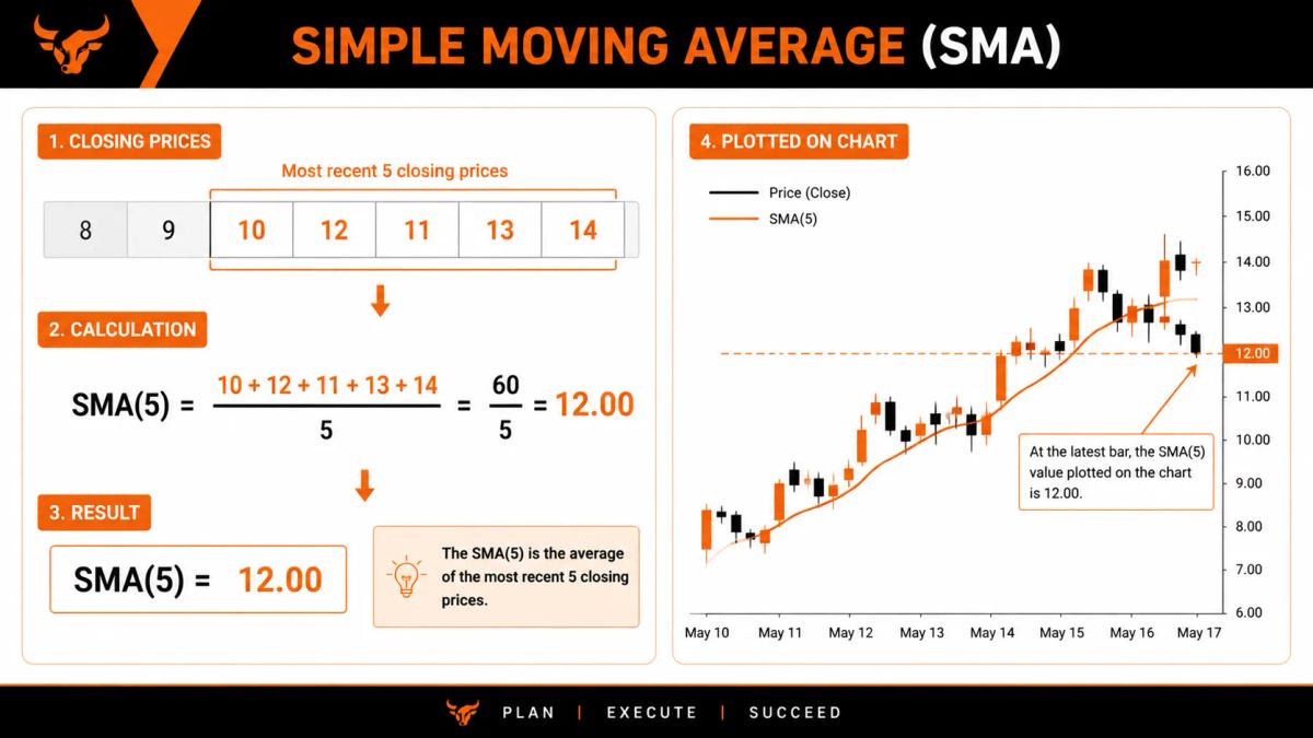
The SMA is easy to calculate, easy to interpret, and watched by a huge number of traders, which matters more than it might first appear. The levels an SMA produces often hold weight for the simple reason that so many people are watching the same line and reacting to it at the same time. It also handles sharp spikes gracefully, refusing to overreact to a single dramatic candle.
The drawback is speed, or rather the lack of it. The SMA reacts slowly, which can keep you sitting in a position long after the move that justified it has run out of steam. There is a second, subtler issue too. Since every price counts equally, a single stale outlier still sitting inside the window can keep tugging the line in a direction that no longer reflects where price has actually gone. The average remembers that old candle right up until it finally drops out.
Exponential Moving Average (EMA)
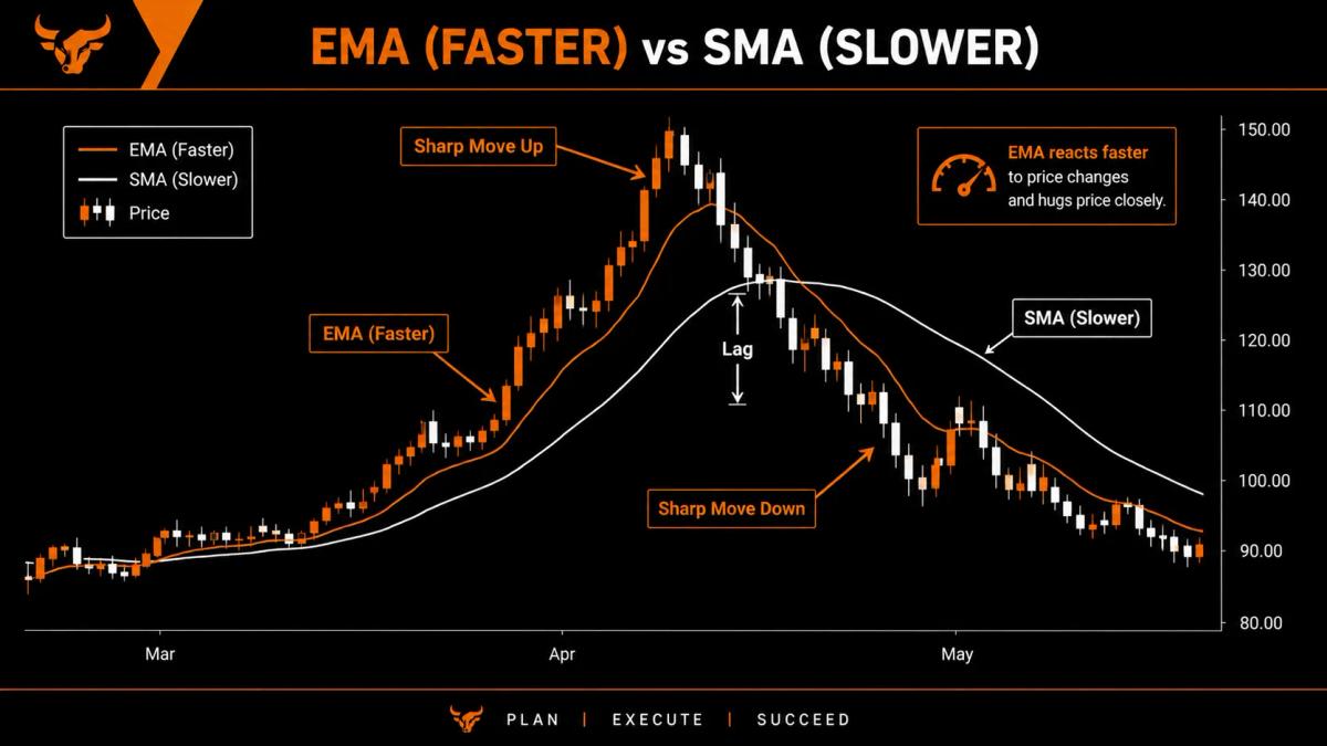
The exponential moving average was designed to deal with that sluggishness head-on. Instead of weighting every price equally, it gives the most recent candles the loudest voice and lets older ones fade in importance the further back they sit. The latest price pulls hardest on the line.
The result is an average that hugs current price more tightly and turns sooner when momentum shifts. If the SMA is the steady friend who waits to be sure before changing their mind, the EMA is the one who reacts the moment the mood in the room shifts.
That responsiveness is its great strength. The EMA picks up changes in direction earlier than an SMA of the same length, which can matter a great deal when you are trying to catch a move while it still has room to run. It also tracks price more closely day to day, so the line feels more connected to what you are actually seeing on the chart.
The same sensitivity is its weakness. In choppy, sideways conditions, the EMA reacts to small moves that go nowhere, generating signals that look convincing in the moment and then quietly fizzle out. The faster an indicator responds, the more often it responds to nothing in particular, and the EMA is no exception to that rule.
SMA vs EMA: Which Should You Use?
There is no universally correct answer here, and anyone who tells you otherwise is probably selling something. The right choice depends on how you trade and on what you are trying to see.
Longer-term traders often gravitate toward the SMA for its stability. When you are holding positions for weeks or months, a little extra lag is a fair price for a line that ignores short-term noise. Shorter-term traders tend to prefer the EMA for its quicker response, since a faster signal is worth more when you are in and out within days or hours.
The most useful thing you can do is stop debating it in the abstract and put both on your own charts, on the markets and timeframes you genuinely trade. Watch how each behaves around the moves you care about, then keep the one that fits the way you make decisions.
Here is the contrast at a glance.
Neither is better in any absolute sense. They are simply tuned for different jobs.
Choosing a Moving Average Period
The period is simply how many candles the average looks back over, and changing it changes the indicator's entire personality. A short period and a long period of the same type can behave like two completely different tools, so this single setting deserves real thought rather than a default you never revisit.
Short, Medium, and Long Periods
Short periods, roughly 5 to 20, react quickly and are useful for reading near-term momentum. The cost is that they whipsaw often, flipping direction on moves that turn out to be meaningless. They are responsive and twitchy in equal measure.
Medium periods, somewhere around 20 to 50, sit comfortably in the middle. They smooth out the smallest wiggles while still tracking the intermediate trend closely enough to be useful for swing-style decisions.
Long periods, in the 100 to 200 range, are slow and deliberate by design. They more or less ignore the day-to-day wobble and instead define the broad, dominant trend that the whole chart is moving within. When you want the big picture rather than the next few candles, this is where you look.
The 50 and 200 Period Averages
Two settings draw more attention than any others: the 50 and the 200. They have become reference points the entire market quietly agrees on.
The 50-period average is the standard read on the medium-term trend, the line many traders glance at first to judge whether the recent direction is holding. The 200-period average marks the long-term trend and is widely treated as the dividing line between a healthy uptrend and a deeper downturn. When price sits above its 200, the broad backdrop is generally considered constructive; when it slips below, plenty of traders take notice.
Part of the weight these two carry comes from sheer popularity. Because so many traders watch the same 50 and 200 levels, price often reacts around them, which in turn reinforces why everyone watches them in the first place. It is a self-fulfilling habit, but a useful one to be aware of.
How Traders Use Moving Averages
Once the line is on your chart, it earns its keep in a handful of practical ways. None of them is complicated on its own, and together they cover most of what traders actually want from the indicator.
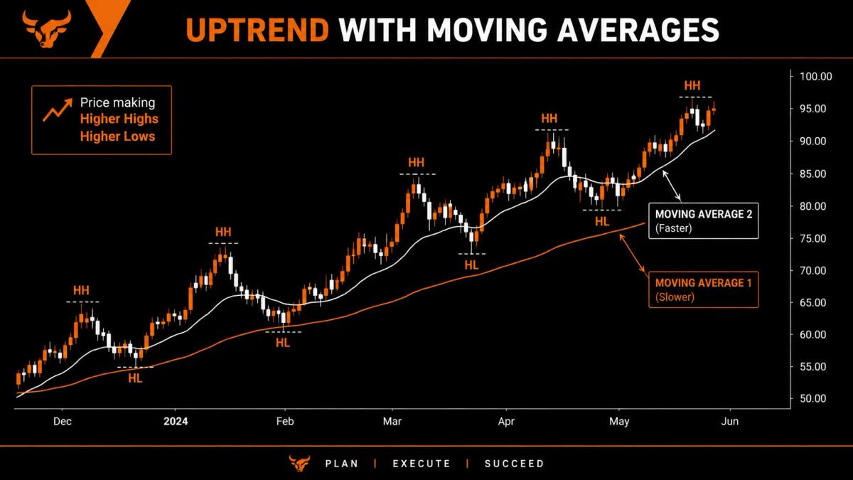
Identifying Trend Direction
Moving averages can you help spot market trends. When price sits above a rising moving average, you are looking at an uptrend. When price sits below a falling average, it is a downtrend. And when the average flattens out while price keeps crossing back and forth over it, the market is ranging and has no clear direction to offer you. The slope of the line tells you a great deal at a glance.
Dynamic Support and Resistance
Moving averages also behave like moving floors and ceilings. In an uptrend, price often dips back toward the average and then bounces away from it, almost as if the line were holding it up from below. In a downtrend, the reverse plays out: price rallies up to the average and gets turned back down. These levels are not guaranteed to hold, but they show up often enough that traders watch them closely as places where a reaction might occur.
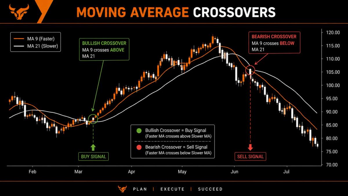
The Moving Average Crossover Strategy
A third use puts two averages of different lengths on the same chart and watches where they cross. When the faster, shorter average climbs above the slower, longer one, that is a bullish crossover. When the faster average drops below the slower one, that is a bearish crossover. Each is a rough signal that momentum may be changing hands. The faster line reflects recent price more closely, so when it overtakes the slower line, recent strength is outpacing the longer trend.
Golden Cross and Death Cross
Two crossovers in particular are famous enough to have earned their own dramatic names.
A golden cross occurs when the 50-period average rises above the 200-period average, a combination many traders read as a potential long-term uptrend signal. A death cross is the mirror image: the 50-period average falls below the 200-period, pointing to a possible long-term downtrend. The names sound far more cinematic than the events usually feel in real time.
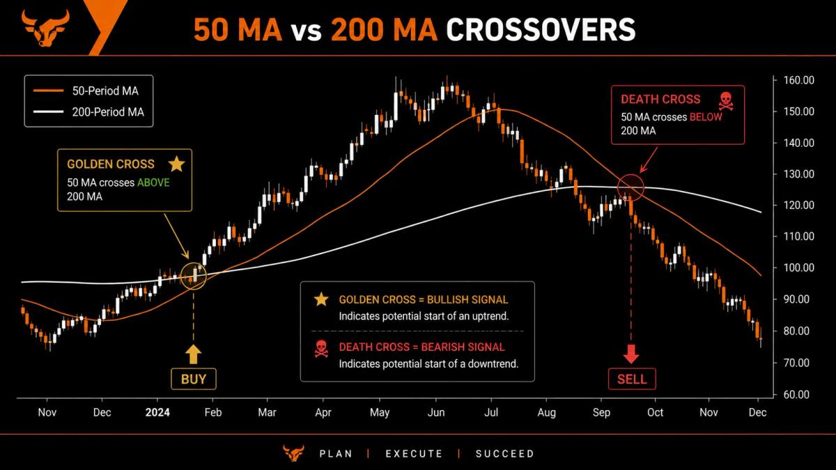
Both are lagging by nature. Because they involve long averages, they describe large shifts that are already well underway rather than handing you a precise moment to enter. By the time a death cross prints, much of the decline it signals has often already happened. Treat them as confirmation that a larger trend has changed, not as a starting gun.
Limitations and Common Mistakes
The core limitation never really goes away: lag. A moving average can only tell you what price has already done, so it will always confirm a move rather than predict one. Once you accept that, the indicator becomes far more useful, because you stop asking it for something it was never built to give.
A few mistakes show up again and again:
- Leaning on moving averages in a ranging market, where the line offers little more than noise and generates one false signal after another.
- Trusting a single crossover or touch on its own, with no supporting evidence from price action, volume, or other tools behind it.
- Over-optimizing the period until it fits past data perfectly, which tends to produce settings that look flawless on history and then disappoint the moment real money is on the line.
It is also worth keeping firmly in mind that no indicator changes the basic reality of the market. Moving averages can sharpen your read on a trend, but they cannot remove risk, and trading always carries the genuine possibility of losing money. A clearer chart still carries every bit of the risk the market always had.
Frequently Asked Questions
What is the best moving average for beginners?
A 50-period SMA on the daily chart is a sensible place to start. It is slow enough to filter out most of the noise and simple enough to interpret at a glance, which lets you focus on learning how the line behaves before you start fine-tuning anything.
What is the difference between SMA and EMA?
The SMA weights every price in its window equally. The EMA gives more weight to recent prices, which makes it quicker to react to changes in direction. That single difference drives almost everything else about how the two behave.
What period settings should I use?
It depends on your timeframe and your goals. Shorter periods suit faster trading and near-term momentum, while longer periods suit position trading and reading the dominant trend. The best approach is to test a few on your own charts and keep what fits.
Are moving average crossovers reliable?
They lag, so they confirm moves after those moves have already begun rather than calling them in advance. Treat a crossover as one input alongside other analysis, not as a standalone trigger you act on blindly.
What do the golden cross and death cross mean?
A golden cross is the 50-period average crossing above the 200-period, generally read as an uptrend signal. A death cross is the 50-period crossing below the 200-period, read as a downtrend signal. Both describe long-term shifts and tend to arrive late.
Do moving averages work across different markets?
Yes. The same logic applies to stocks, forex, crypto, and commodities, because each one produces price data that can be averaged in exactly the same way. The settings you favor might change from market to market, but the underlying tool does not.
About the authors


Related articles

Candlestick Patterns Explained: A Practical Visual Guide
Candlestick patterns explained for new traders: read doji, hammer, and engulfing signals with clear visual chart examples.

Demo to Live Trading Guide: How to Make the Switch Without Blowing Up
Learn how to move from demo to live trading without blowing up. Covers mindset, position sizing, and your first week live.
0 comments